Magnetic Magazine Conceptual Design
Client: Magnetic Magazine
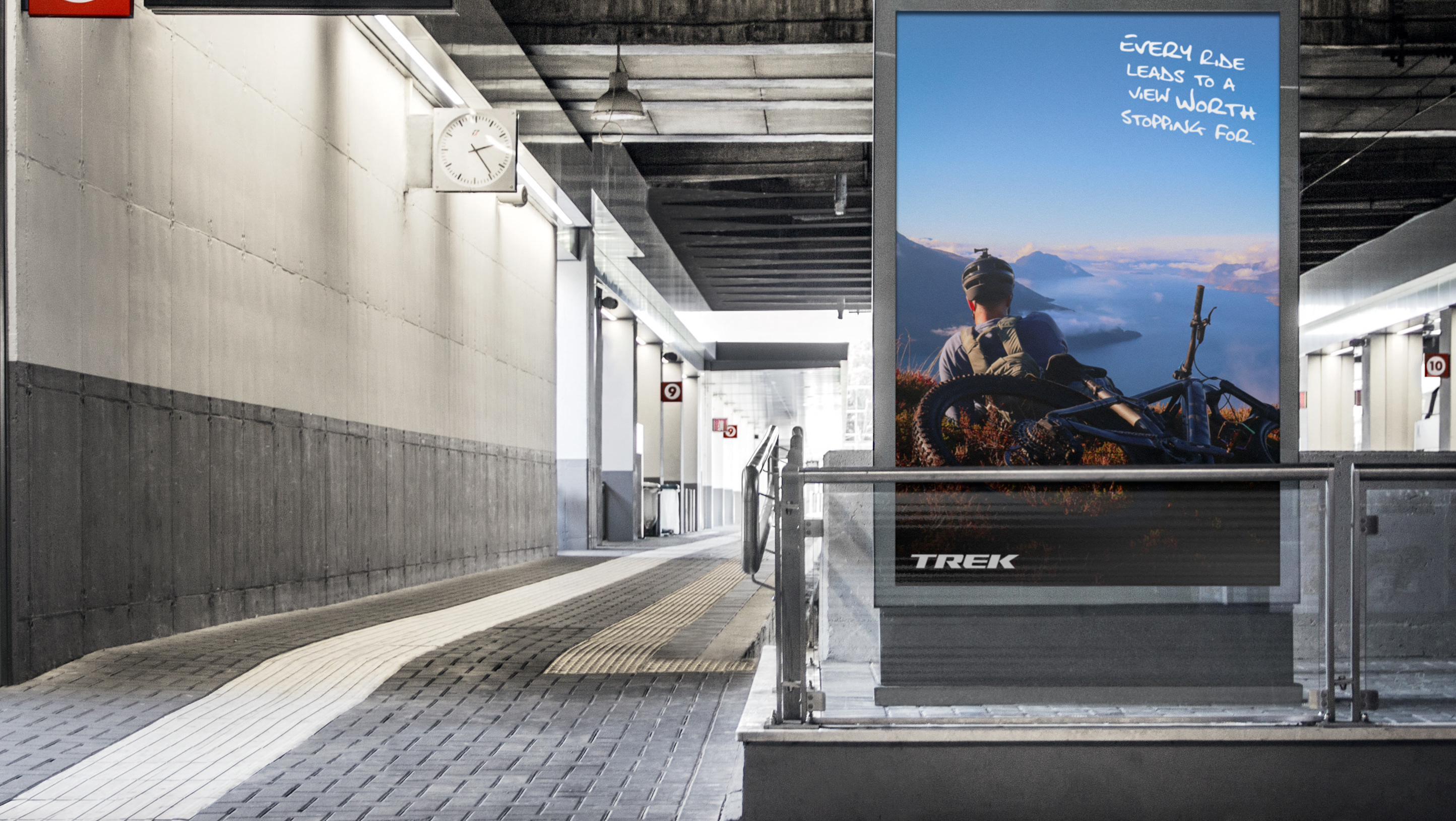
Magnetic Magazine is an online publication dedicated to progressive music culture, including genres such as e
lectronic, indie rock, hip-hop, and neoclassical. The magazine also covers sustainability, travel, camping, and
festival life. With a global readership and distribution goals, Magnetic Magazine seeks to create a printed
quarterly edition distributed at international events to provide a calm, long-lasting space for readers to
engage with their curated content.
The goal is to design a visually compelling and cohesive magazine that reflects its brand identity while eng
aging an international audience. The project includes developing a unique cover design, table of contents, and
layouts for four selected articles, with one feature article inspiring the cover artwork.
Deliverables
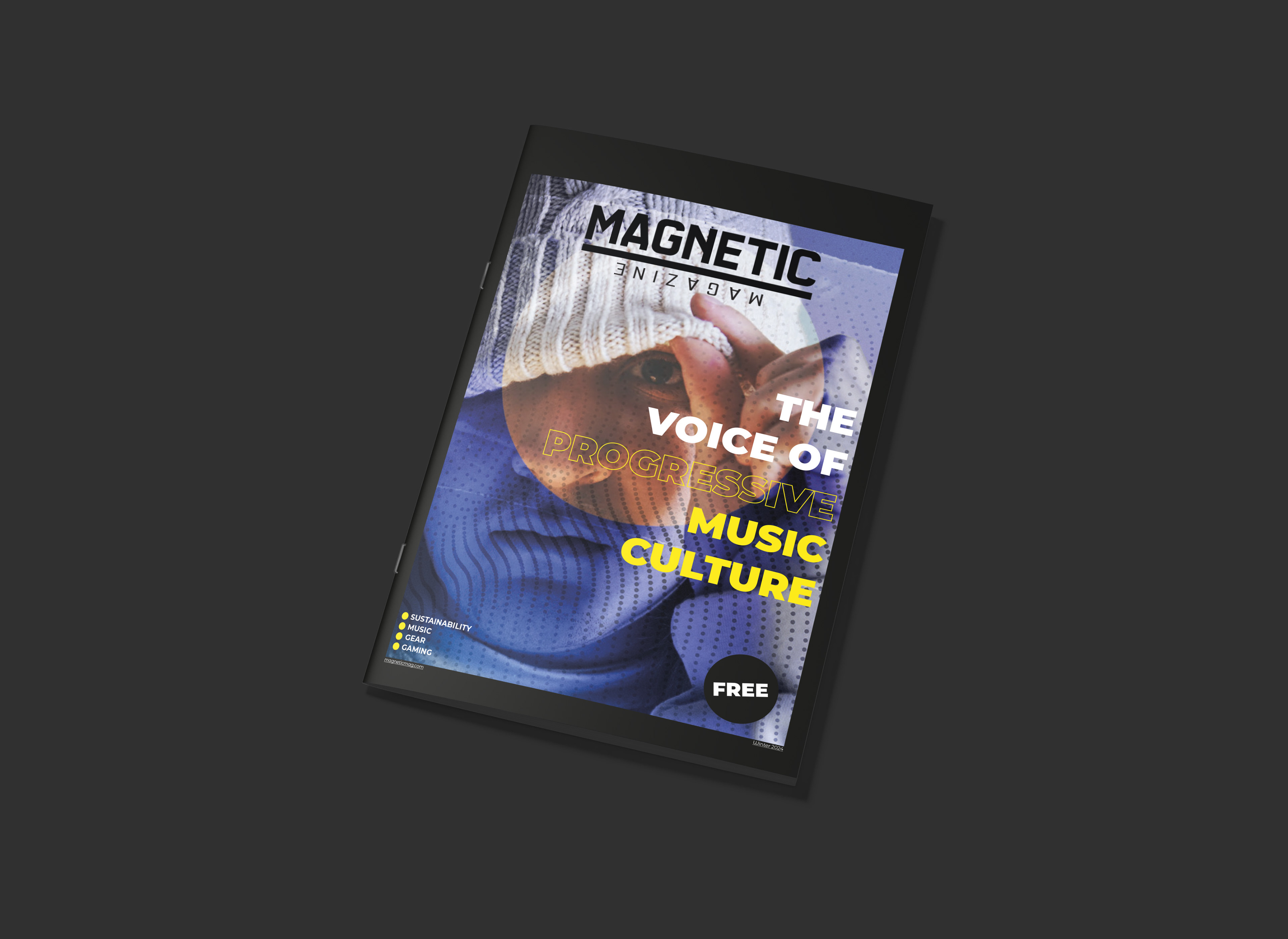
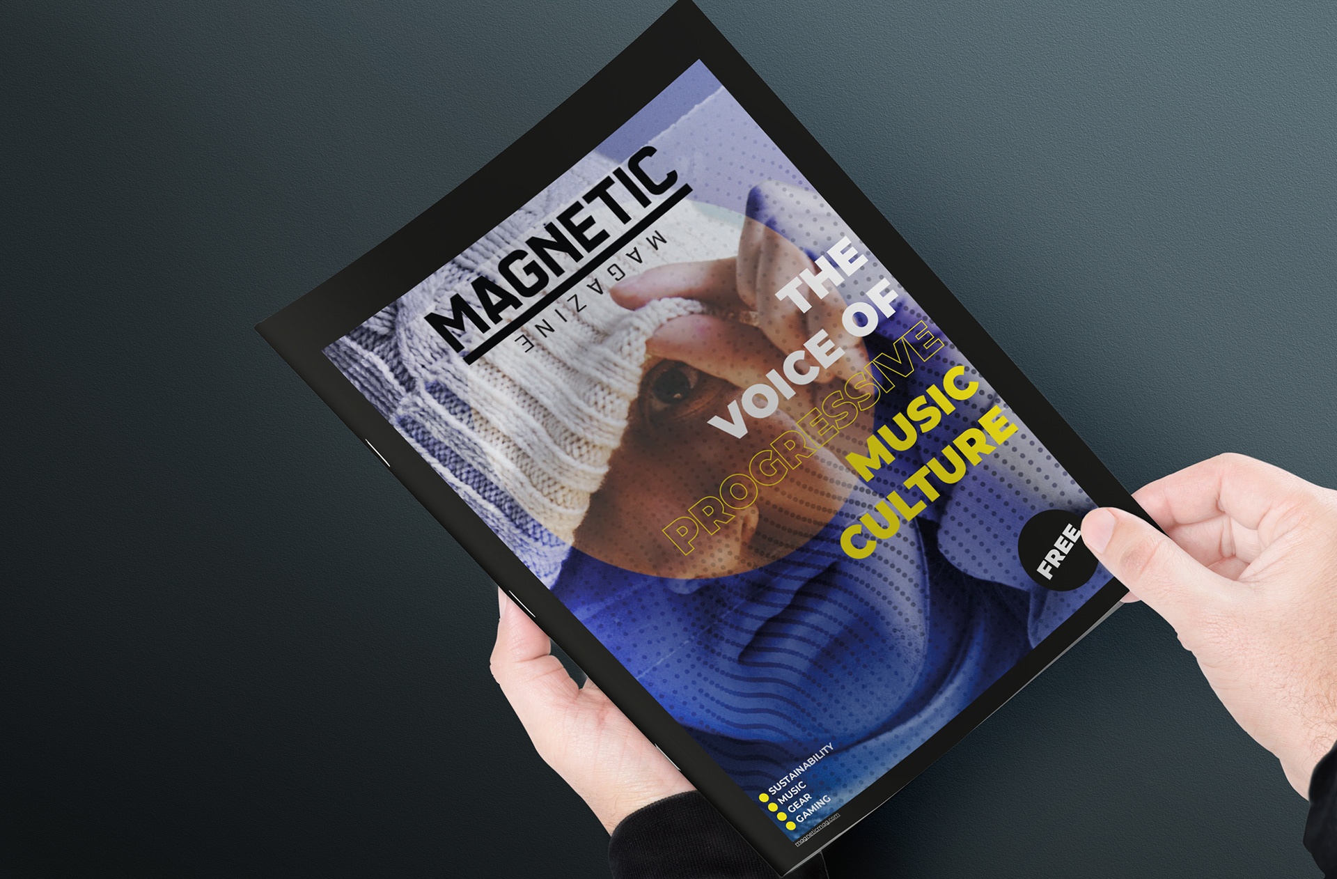
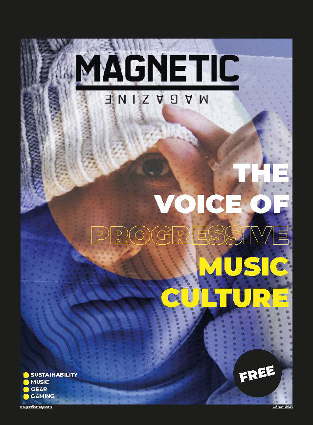
Cover Page:
A newly designed header/logo (optional).
Slogan: "The Voice of Progressive Music Culture."
Fictional seasonal date: "Summer 2023."
Website: magneticmag.com.
The word “Free” is displayed.
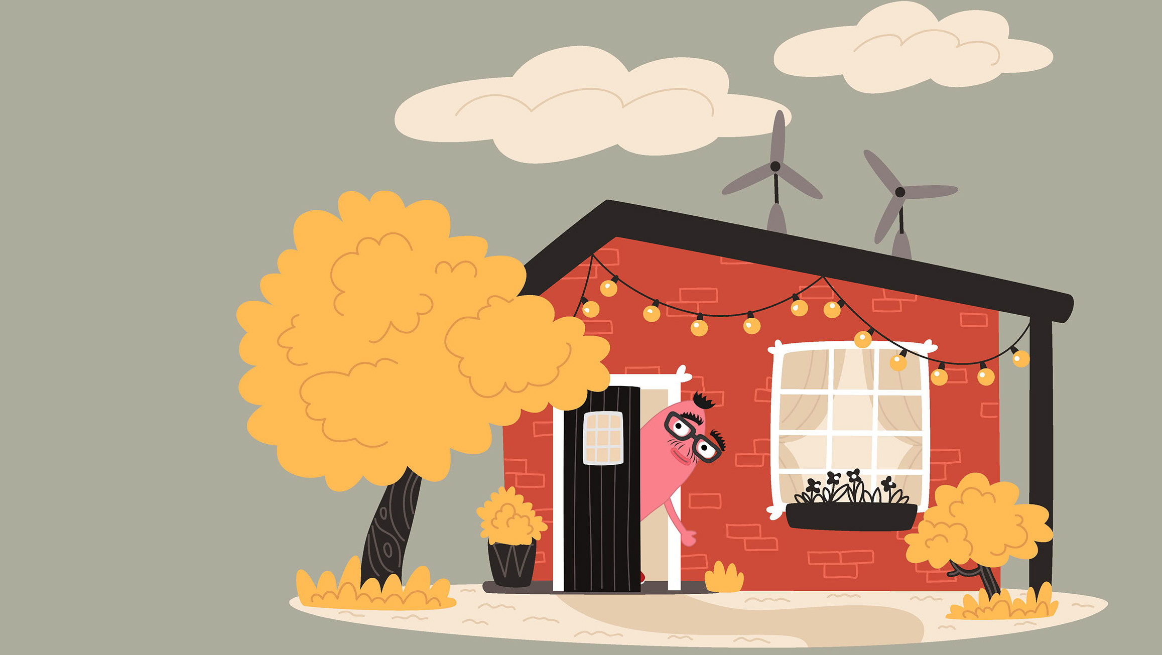
Custom artwork inspired by the feature article.
Optional: Article highlights formatted to suit the cover design.
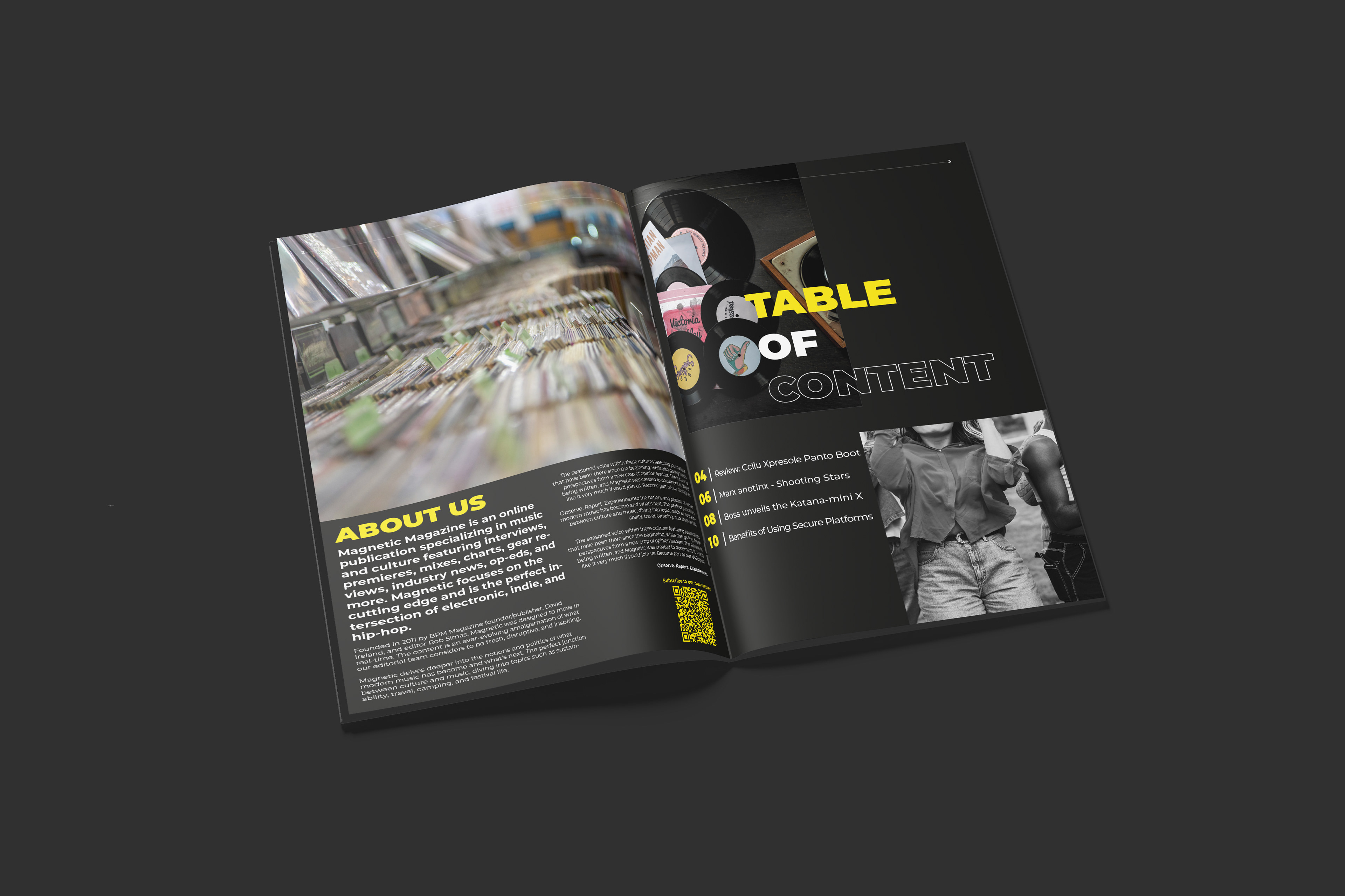
Table of Contents:
Spread showcasing the index layout.
Adjacent blank page with an enticing “About Us” section, including the description of Magnetic
Magazine’s ethos and global reach.
Four Article Layouts:
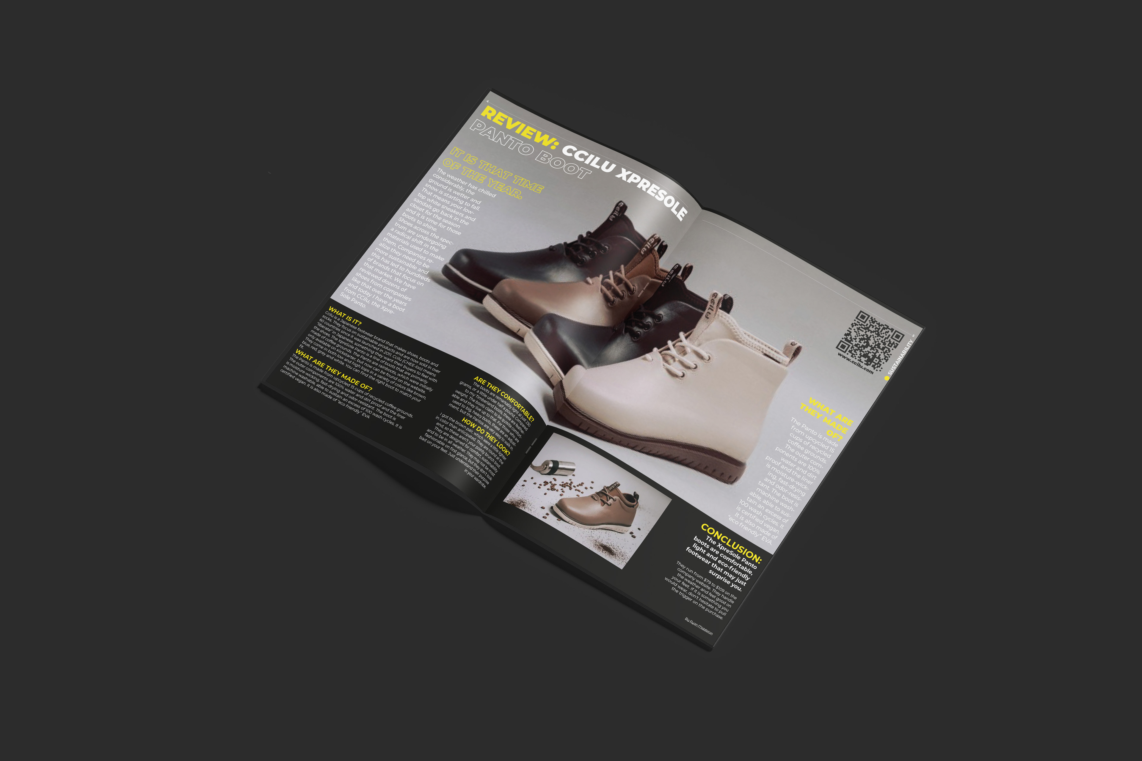
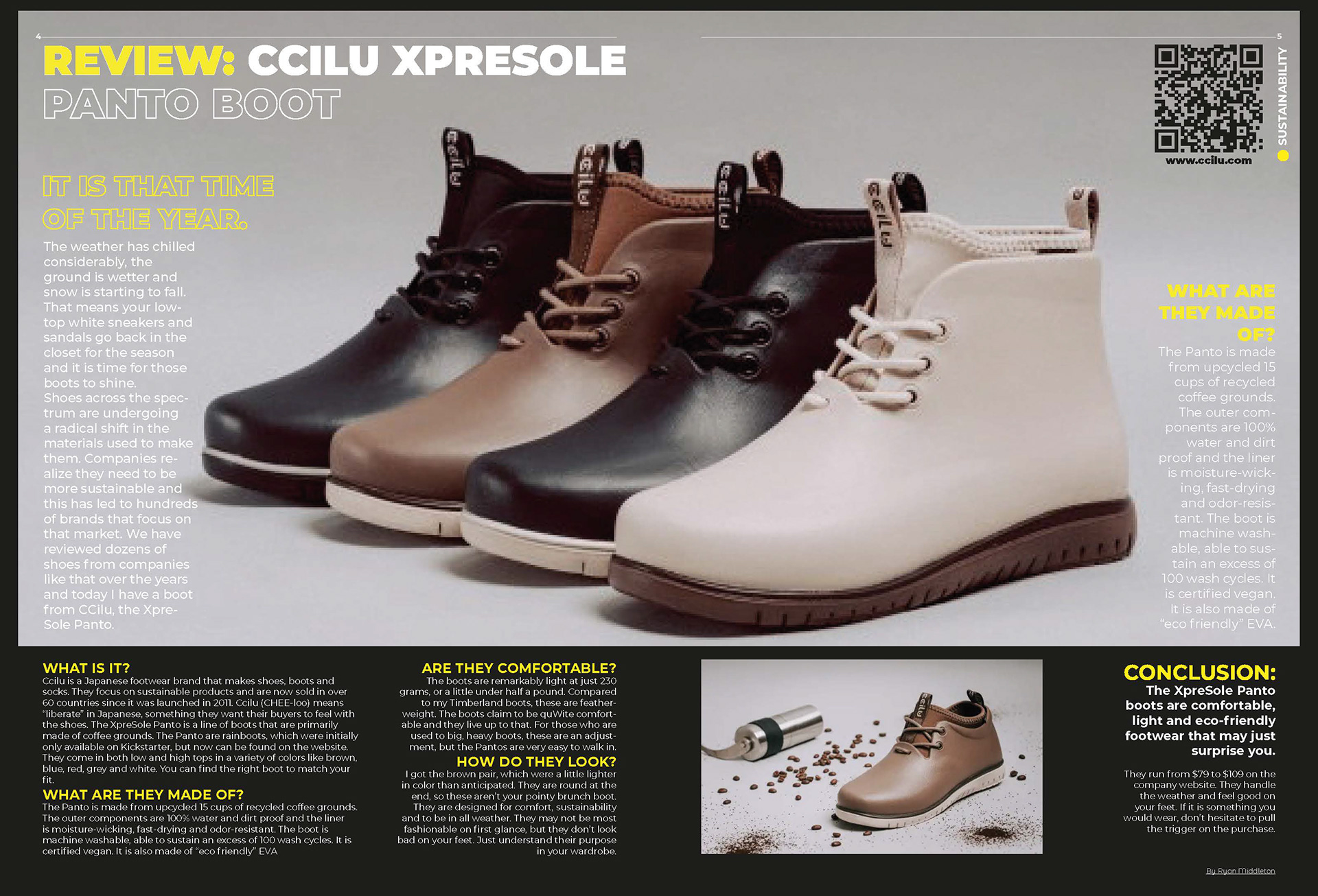
Sustainability: Ccilu Xpresole Panto Boot
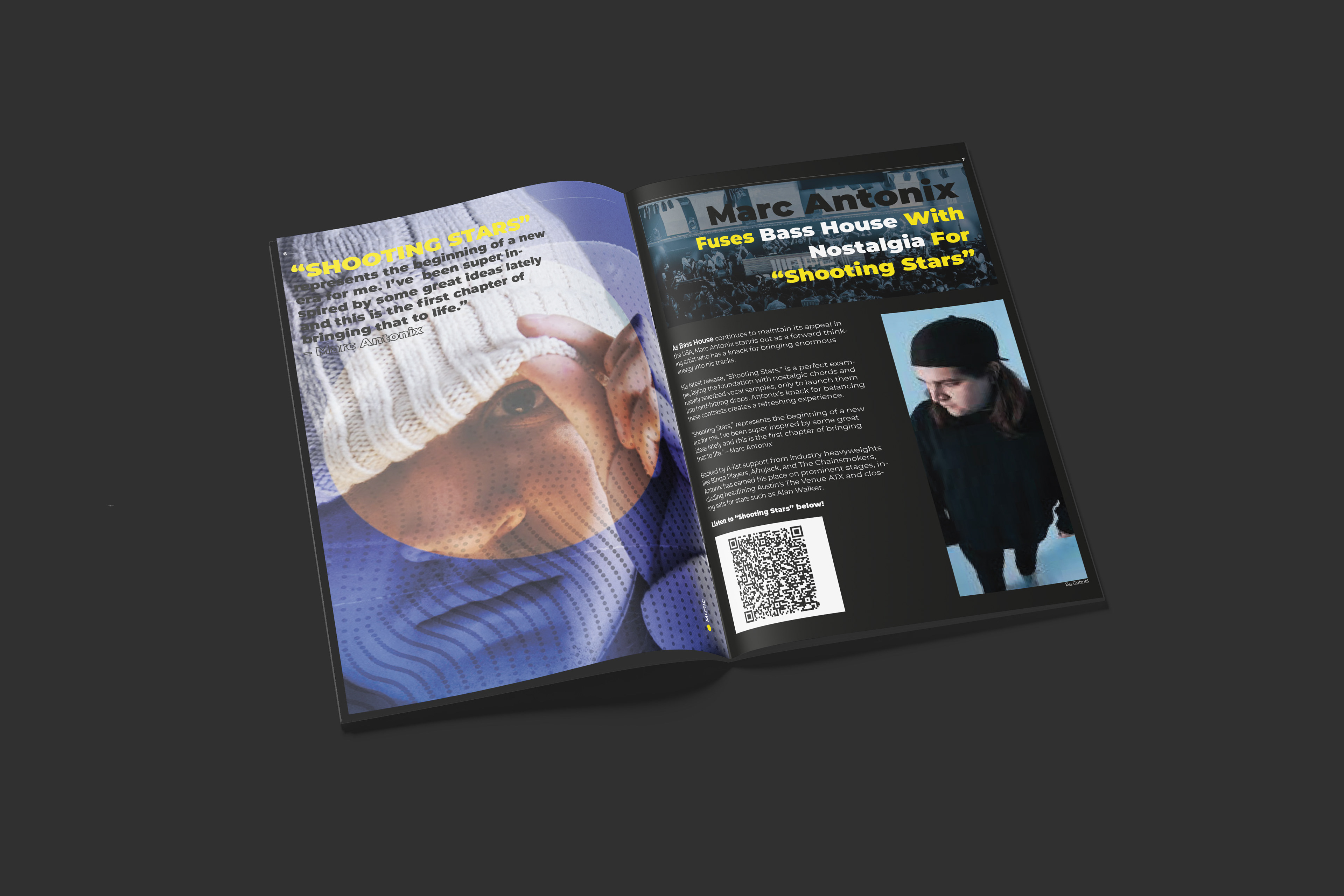
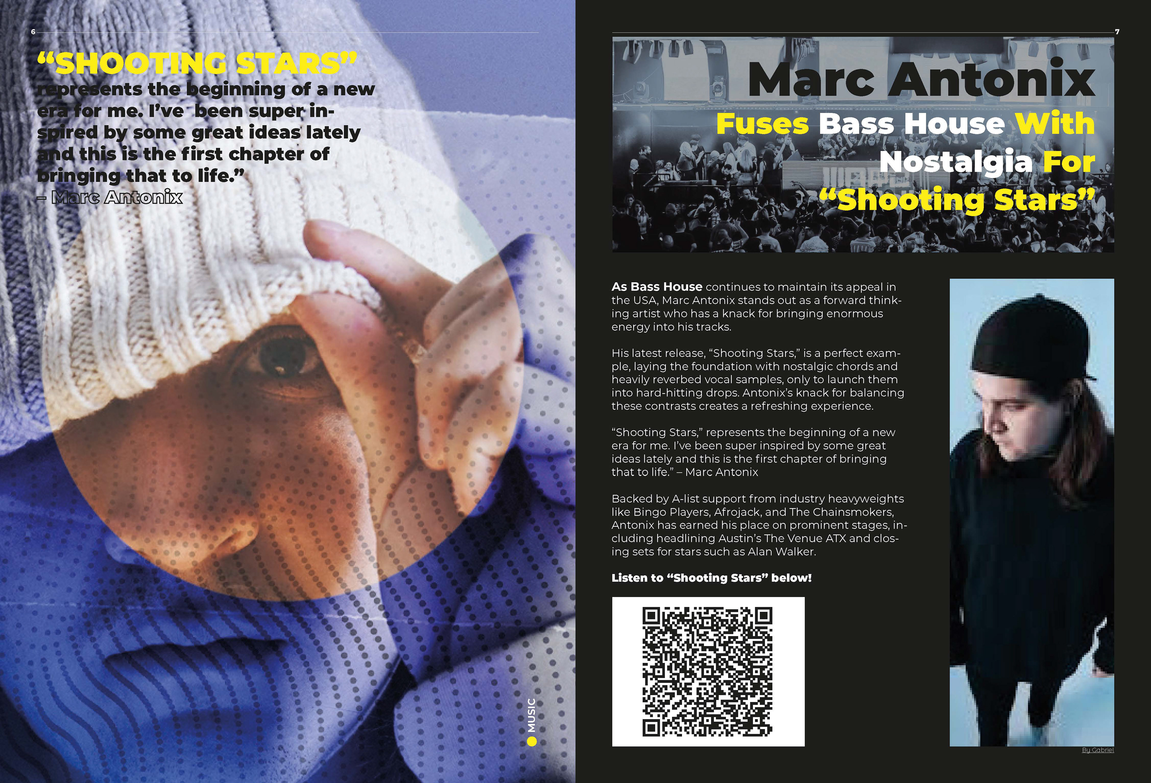
Music: Marc Antonix – Shooting Stars
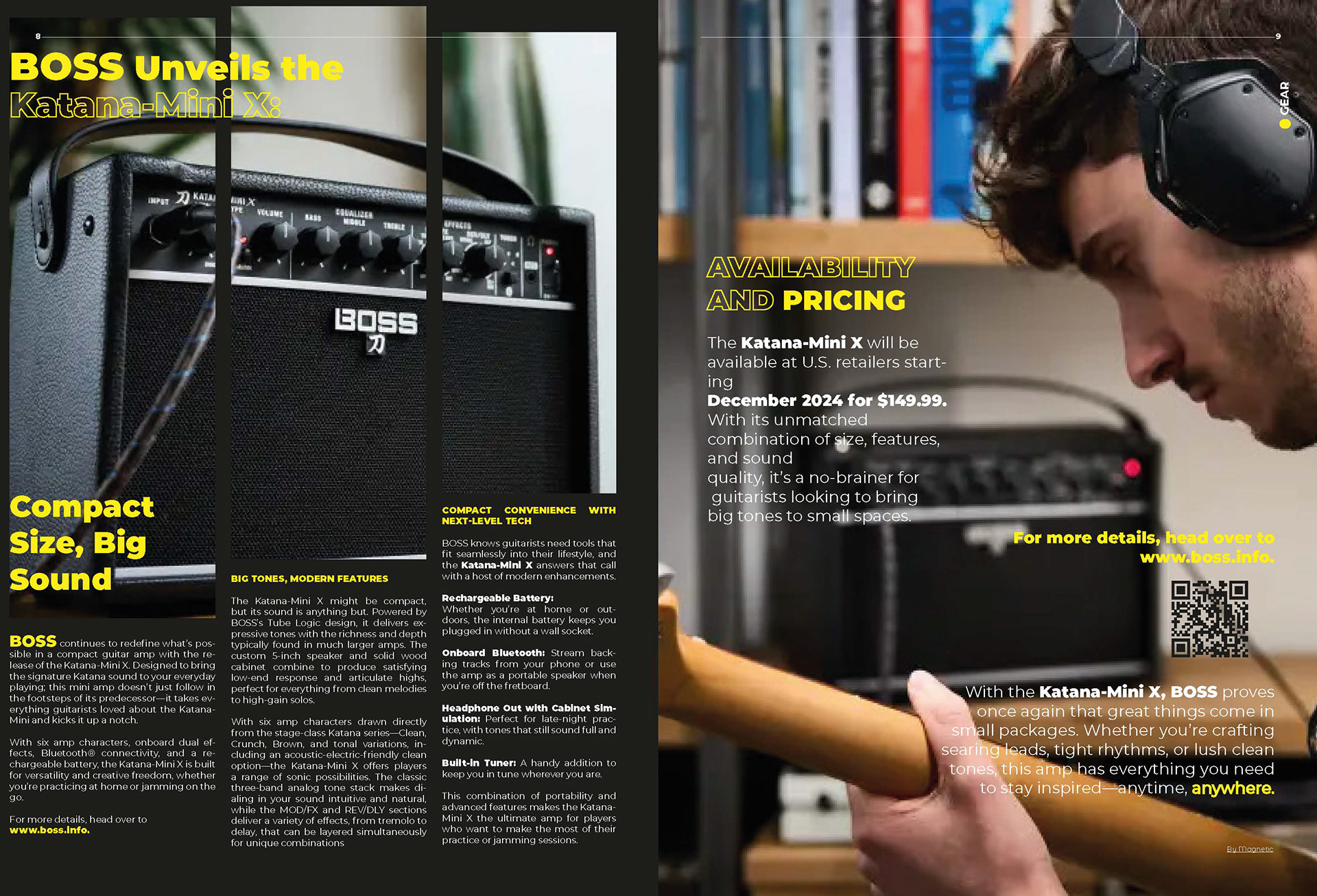
Gear: BOSS Katana Mini X Amplifier
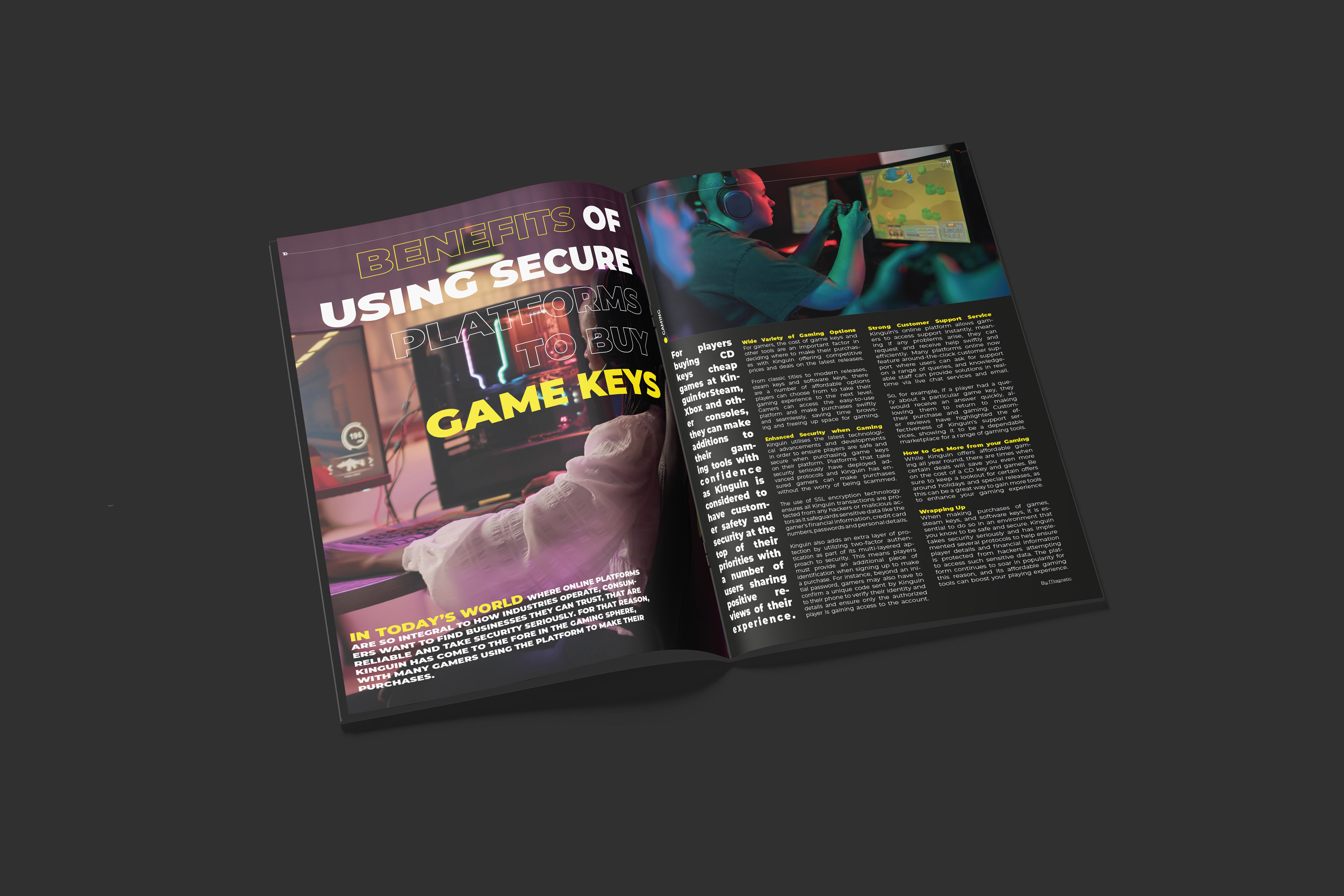
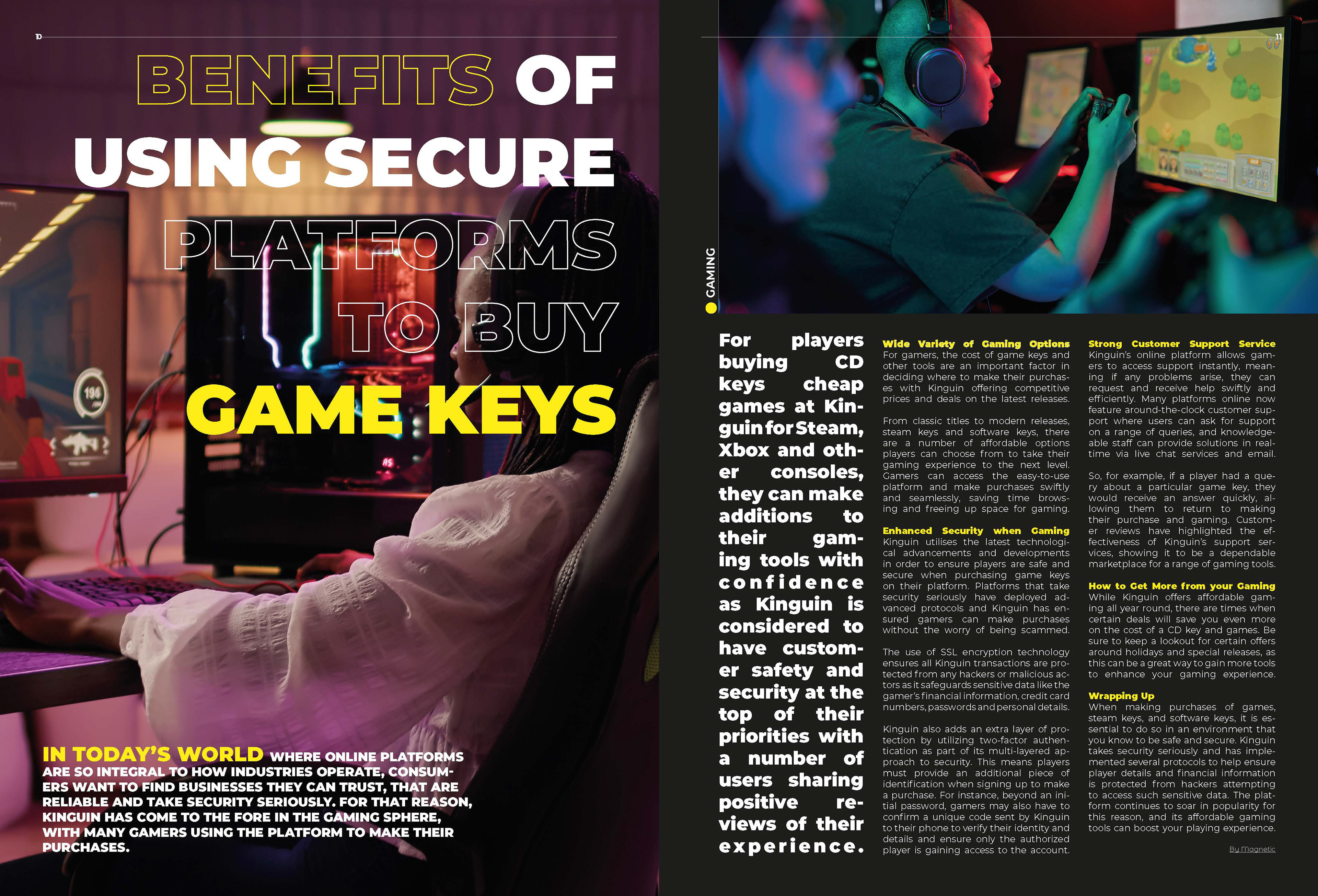
Gaming: Benefits of Secure Platforms for Game Keys
Music: Marc Antonix – Shooting Stars
Gear: BOSS Katana Mini X Amplifier
Gaming: Benefits of Secure Platforms for Game Keys
Each article layout will include:
Title, byline, introduction, subheadings, body text, captions, and pagination.
A mix of provided photography from the Magnetic magazine and each article's website.
Writer and photographer credits.
Feature Article & Custom Design:
The feature article will be a deep dive into a topic that aligns with Magnetic’s mission.
Custom-made artwork for this article will also appear on the cover, tying the design together
visually and conceptually.


Design Approach:
Visual Direction: Modern, clean, and bold aesthetics that reflect the dynamic culture Magnetic represents. The design will blend photography and typographic elements to create a visually striking yet approachable layout.
Typography: Easy-to-read fonts paired with bold, expressive headers.
Color Palette: Inspired by the dark themes online and the article content, ensuring a fresh and vibrant look for each issue.
Imagery: A mix of large, impactful visuals and detailed, shots to balance the layout and engage readers.
Interactive Elements: Suggestions for QR codes or links in the printed magazine to drive readers to Magnetic’s online multimedia content.

Reflection:
This project challenged me to think holistically about brand identity and user experience in print design. I learned to create cohesive layouts that integrate multimedia components and engage a diverse, international audience. The iterative process of designing custom artwork and ensuring all elements tied back to the brief strengthened my ability to conceptualize and execute a client’s vision while maintaining creative integrity.